Data Visualisation: Telling compelling stories with data

Have you ever struggled to make sense of complex data? In today's data-driven world, you're not alone, which is why the ability to present information in a graphical and visual way has become increasingly important. Let's explore how data visualisation can help us understand and communicate statistics more effectively.
Why visualise data?
The human brain can process visual information far more efficiently than textual information. That's why a well-designed chart or graph can instantly convey data patterns and trends that might take paragraphs to explain. When C&SD presents social or economic indicators, carefully chosen visualisations help readers grasp key insights at a glance.
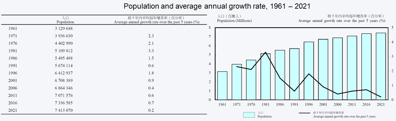
Taking the above table and chart as an example, compared with the table, the chart can better express the trend of population size and its growth rate.
How to choosing the right visual?
Different stories need different visuals, see the 2021 Population Census results as examples:
Keys to effective visualisation
Like a good story, effective data visualisation needs three essential elements:
- Accuracy: Numbers must be presented truthfully!
- Visual hierarchy: Important information should stand out!
- Simplicity: Less is more!
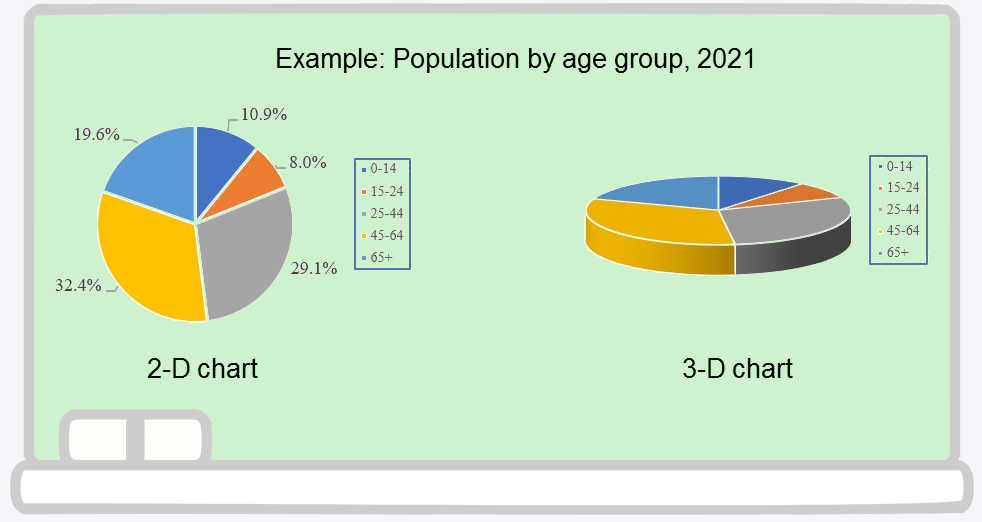
Look at the above pie charts showing population by age group - the 2D version clearly shows the proportions, while the 3D effects distort the actual values. Using consistent scales and proper proportions ensures that your audience gets reliable insights. A small visual distortion could lead to big misunderstandings.
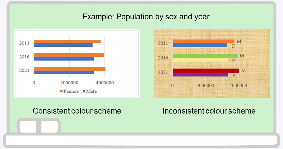
The chart on the left uses distinct colours and clear alignment to help readers grasp the population statistics by year and by sex instantly, while the colourful chart on the right can be very confusing and divert readers away from the main point. Through clever use of size, colour, and spacing, we guide readers to key information.
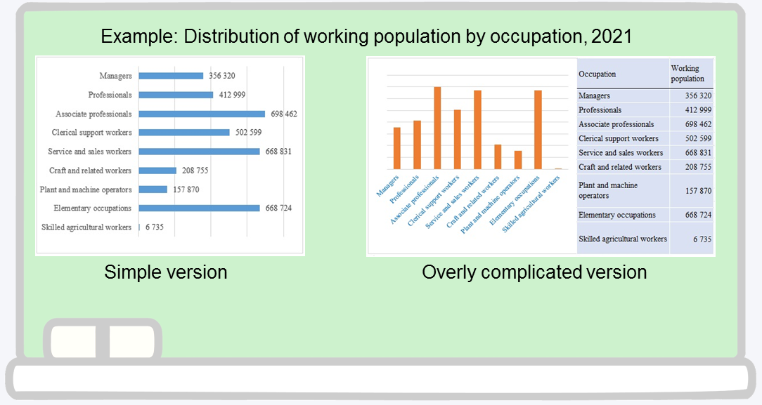
Compare the above occupation breakdowns - the left version uses clean bars with direct labels, making the data instantly clear. The right version splits the same information across a chart and a table, making it harder to read. Simple design choices can make complex data easy to understand.
From Data to Discovery
Numbers tell stories - but only when presented properly! Whether you're exploring market trends or revealing hidden patterns, effective visualisation turns data into "aha!" moments. Ready to make your data speak? Let's start the journey of data visualisation!
NG Hoi-chun, Jason
Statistician
28 February 2025